Purveyor Design’s Bethune Townhouse is authentic, unpretentious and clean. Moreover, it is intuitive (the basis of the design scheme is eclectic and original: it does not rely on trends), the palette is astute and minimal – and it projects a relaxed yet coherent and sophisticated ambiance.
__________________________
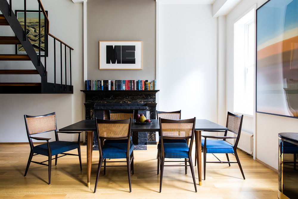
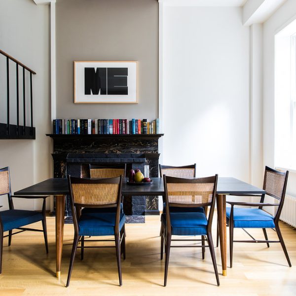
While the construction of the home appears simple and it is difficult to pin-point a specific style, it has obvious and worthy attributes in keeping with the history of the house. Those qualities are found in the original fireplace and surround, the high ceilings and generous elegant windows. The latter contribute to a luminous expansive milieu by recourse to the entry of natural light – creating a distinct atmosphere all its own.
The clever sedate design in company with the architecture makes the home seem much more than the sum of its parts!
_________________________
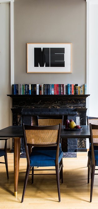
The fireplace with books on the mantle above. Books inevitably add charm, understated richness and texture. The books and fireplace add credibility while contributing definitively to the ‘story’ of both the residents and the house. This section creates a harmonious tableau of interest, urbanity and style when considered in combination with the artwork above.
A relatively simple table and chairs are ‘light’ on the floor. And whilst the table and chairs are not ‘a set’ (the inhabitant’s likely eschew sets, rather they are eclectic collectors – putting things they love together to form a unique personal style), the design of each compliments the other: both imbued with a midcentury ‘Danish’ sensibility. Additionally, the chairs emit added lightness and seamless texture due to the use of rattan: a neutral material that connects easily to the timber aspects throughout.
And there is irony. A playful and prominent, yet ‘neutral’, artwork ME, aligns conceptually with the architecture and decor. The tones, a-typical style it projects and the simple geometry of the letters makes it graphically powerful.
Moreover, the ‘ME’ image obliquely refers to the design scheme and the residents of the home: ‘this is ME’ – this is the image I want to project.
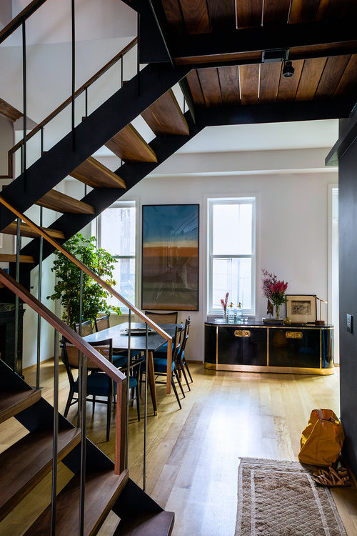
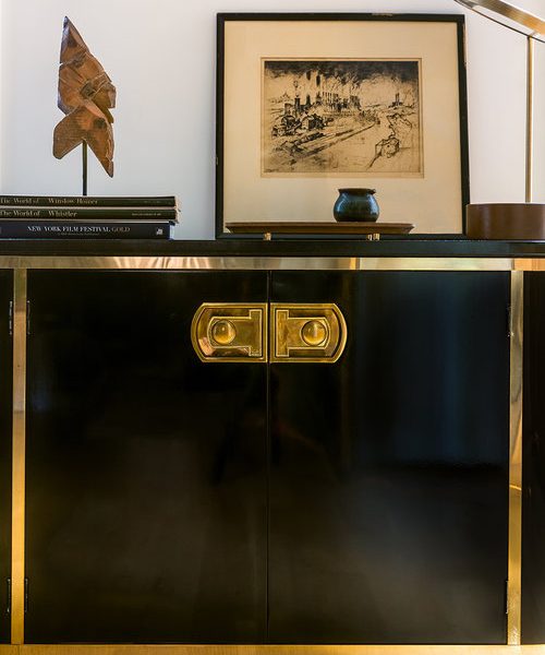
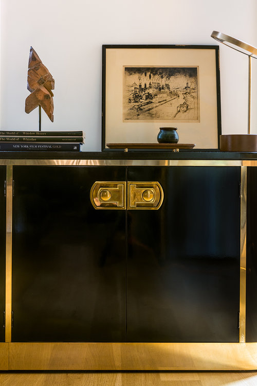
If you look closely you will note the inter-relationships between the few objects in the room. The judicious unification of both colour and texture. ‘Black’ for example: the fireplace, tabletop, black Art Deco-style lacquered cabinet, the landing artwork’s frame, and the word ME. Here judicious means that the use of black is predominantly in larger blocks, it is not ‘dotted’ around but appropriately condensed to create subtle impact. In this context black is intricately related to the texture of the larger object rather than merely exhibiting as a colour.
The aforementioned pale neutral tones and textures are synchronised. Flooring, table legs, rattan, stairway ‘steps’. The prominent atmospheric artwork adjacent to the lacquered cabinet has a blue tone subtly echoed in the chair fabric.
The residents are both discerning and down to earth, they embrace a cosmopolitan frame of mind, appreciating few yet special objects and a subtle yet integrated design approach. It is a style that enforces a ‘less is more’ mindset, still, the ‘less’ must be high quality, it must have design credibility and it must describe an overall individual fluency.
Purveyor Design have opted for discretion and restraint rather than flamboyance, enabling the room to emit a laid back welcoming sophistication.
__________________________

__________________________
Website: Purveyor Design
Instagram: @purveyordesign

