Once you begin spreading bold colour into many and varied objects within a single room it has a visual ricochet effect.
Interior design is a super personal thing and no one should dictate style to someone else because we all have eccentricities we expect those who know us well to accept. After all, we would not be able to identify uniqueness if everyone did the same thing. On that front it is important to do your own thing and not be driven too slavishly by trends.
Bold colour(s) needs to be focused on a single object, such as artwork, sofa, bedhead, armchair, otterman; that colour must then transition logically (through tone, style, texture and pattern) to other elements within the room.
While dotting a single or two colours may have impact it loses focus and visual comprehension. Instead, your eye darts from one point of colour to the other in a never-ending cycle while cohesion and visual comprehension is lost. (This statement can be qualified by adopting a range of tones within a single hue, that is a different concept again.)
But! Have you ever walked into a room and thought “What was she thinking!” Yes, you can receive an electric shock of the worst kind when you turn the corner and realise a perfectly acceptable or even stunning interior has been completely undermined by “dotting”…
Dotting is the result of the homeowner loving a certain colour and they put it everywhere in small amounts.
The colour might be blue. Imagine a beautiful predominantly white sitting room with fine natural timber bi-folds and a polished concrete floor overlooking the ocean.
She thinks it is a good idea to have a cobalt blue sofa to match the ocean, which on its own would have worked. However, he thinks a cobalt blue sofa is a bad idea because they have plenty of blue to look at outside the door; a good point. Irrespective he is stronger so he wins this argument.
To sate her passion for blue she has an epiphany and thinks, “I’ll buy blue accessories then!” Off she goes and comes home with blue bowls, blue pendant lights, two small pictures of the ocean (what the…?), two small blue picture frames and a set of blue glass vases.
To make matters worse, and self-evidently, they are all different shades of blue.
All these blue items have now been placed, what she believes to be decorously about the living area; but it is fraught because…
- The impact of clean fresh white is lost because your eye starts to ricochet from “one blue dot” to the other in an endless succession.
- Immediately, authority has been stripped from the beauty of the main concept because the room has been fractured by the self-indulgent use of small blue objects.
- Remember this is a home not a small museum, it is not necessary to indulge your love of blue by repeatedly putting “blue things” on display in an ad hoc fashion.
- If you must collect blue things, think about what you need before buying them, then design a special place for all of them to go that complements the overall sophistication of white interior with pale timber and a polished concrete floor.
- In the predominantly white scheme, obtain a shelving unit (or perhaps two sets for two different areas) and put the items on the shelves staggering them around books and other ephemera like pictures, a clock perhaps and a few different plants.
The qualification…!
There is one important qualification and that is if you are an eclectic collector; that is you collect items of furniture and decorative objects from different historical periods.

If collecting small blue objects is your thing, an eclectic scheme would work better in theory because none of your collected items are designed or meant to go together. For example, you may have three small tableau’s in a single room. In one corner a day bed, an antique trunk, a table lamp and the two small blue picture frames. In another corner you may have an armchair in a floral pattern, with a standard lamp in white, a large palm, a little blue mat on the floor and the little blue pictures of the ocean on the wall behind the chair and lamp. An eclectic style is much more accommodating of dotting colours…
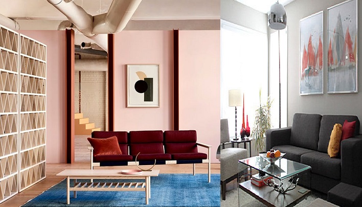
Following are a few examples of seamless with less coherent colour combinations.


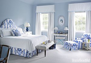
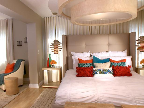
Much better with the red and apricot gone leaving cushions in teal and neutral colours with different patterns. There are two discrete areas here, the bed area and the armchair area. The chair cushion(s) need to complement the bed cushions but in different smaller (more discrete) patterns; teal, white and stone patterns on the bed; teal and stone cushions on the chair. Logically, the patterns on cushions for the chair need to be finer because the armchair is smaller overall than the bed. Three vases on a bedside table…?
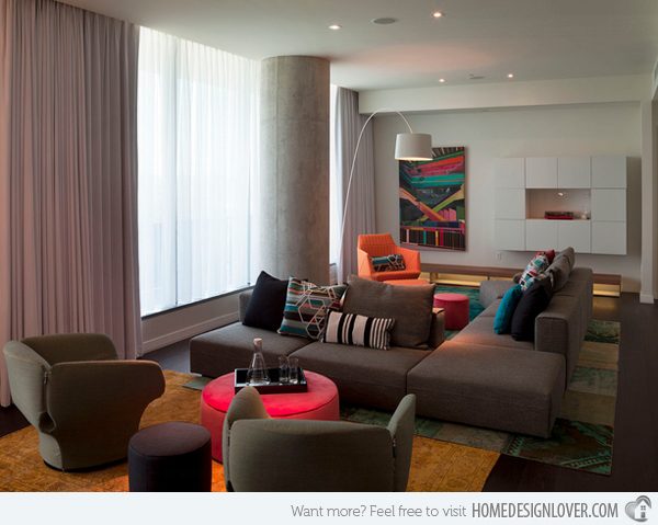
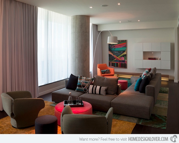
Three colours dotted here! The room could be redeemed by losing the pink table ensemble. Perhaps, keep the art work and apricot chair. The cushions need to be streamlined around a couple of colours that complement both the sofa and the orange chair; differing patterns. There is just too much of the dull donkey colour…


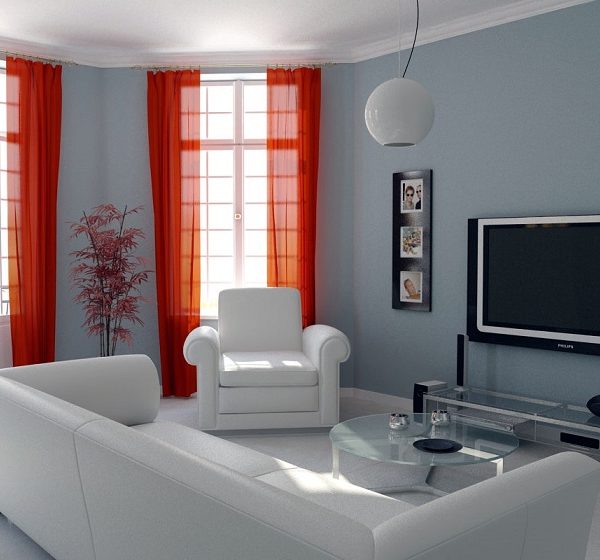
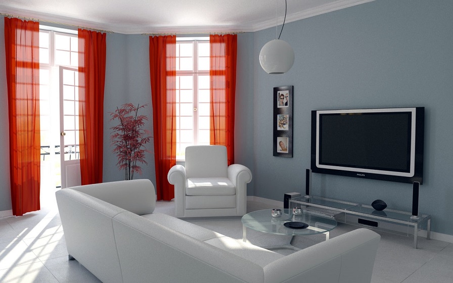
Essentially white room with a bold shot of colour in the curtains; although this conforms to the idea of having a focus, unfortunately that’s all you notice.
If you must have orange curtains, there needs to be “a logical transition” from the white to the orange in both furnishings and decorative elements…
BIERSSCHWALEESTATE: https://goo.gl/VeLVZH
HOUSEBEAUTIFUL: https://goo.gl/FJCzRr
CORAL/AQUA BEDROOM: https://goo.gl/CAjy9r
APARTMENTTHERAPY: https://goo.gl/fYPgp5
MODERNLIVINGROOM: https://goo.gl/oAUsyP

