__________________________
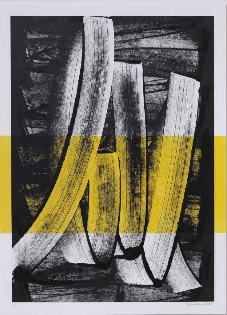
There are many captivating aspects to Zara Dolan’s S-3-HR-#F6D000-SC monotype, however, what immediately impact’s the viewer are the powerful dynamics of form and colour. Along with that, the juxtapositions set up by the subject and the metaphoric implications of the content. Contemporaenously, an intriguing quiet mysteriousness collides with educated consequences.
___________________________
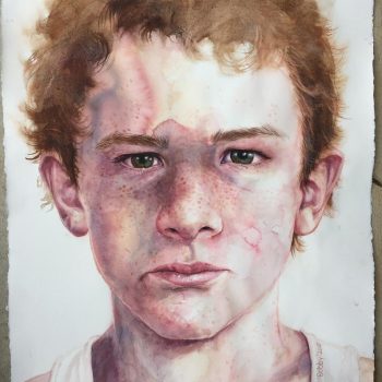
The clean yet forceful hit is down to compelling contrasts: the ‘in-your-face’ visual accompanied by a slightly un-nerving shallow cave-like darkness. Enigmatically a gestural background both merges and contends with a transparent yellow rectangle in the foreground. These elements (aided by some thick black outlines) create a unique set of internal machinations and oppositions. The print image is then partly framed by two yellow quasi-sentinel rectangles, outside the main body of the print.
Specialising in one-off monotypes…my work is spontaneously executed and created the moment before printing. What sets my practice apart is the utilization of a custom-made press, the largest in the county, capable of producing prints measuring an impressive 1.2 meters by 2.4 meters. Such grandeur is exceedingly rare in the realm of handmade monotypes.
The central point and motivation of Dolan’s monotypes is the immediacy of the process based practice: the before and after – two aspects intricately yet, in terms of subject, unconventionally related. The stark juxtaposition could simply come from the artist’s intention for internal drama (a drama enhanced by custom printing on a large scale), however, while a glance at the work in passing (sans engagement) may arrest the viewer, contemplation of the print by receptive viewers means attention to the disparate elements in a bid to make connections and construct meaning. Hence, roiling swathes softly stabilised by an ordered, civilising symbol. Habitually a print is produced in editions, but as a monotype there is only one copy and it is complicated by the content and the process. That in itself adds another layer to both its presence and it’s impact. Additionally,
it’s the most painterly print, as I am also painter, monotypes seemed like the best technique to use as it’s fast, fluid and immediate. And working on a grand scale immerses me completely in the creative process, forging a profound connection to the work – an integral aspect of my artistic journey.
While the above undoubtedly provides moments of frisson and incentive for the artist, on the flip side, the viewer receives a singular impression of spontaneity and rationality shrouded in a sense of intrigue. Partly, that intrigue relates to the fact that
indisputably, art is not produced in a social vacuum, it is generated out of a multitude of human contexts and experiences that arrive to the viewer in a condensed format.
As well as visually commanding these basic elements have greater effect when you view them metaphorically as well as perceptively. What we actually see (shapes, colour, arrangement etc) in company with how those elements move beyond the frame to suggest something else. Specifically, all texts (visual and written) are born out of the contexts and customs we are subjected to throughout our life: both broad and specific. This can be said of the production of the print by the artist as well as the reception of the print by the viewer; explicitly
viewers of the work will both discern and respond to a range of references in specific ways according to the personal, cultural and societal contexts that have shaped their lives.
As mentioned above, artworks are not produced in a vacuum, they are produced out of and from within the contexts that have conditioned or conventionalised the artist from the moment they are born (private and public). Those contexts comprise ‘who we are’ and the totality of our life (both physically and psychologically). One obvious example is that in the main, in the West, the communities we live in and integrate with are based upon the principles of democracy. Therefore, if we live the whole of our life within a democracy, it stands to reason that all objects and artworks we produce are in some way shaped by those democratic forces and the institutions, communities and conventions that impact us within that democracy.
__________________________
Similarly, we have been conventionalised to think of the sun as yellow, the ocean as blue, forests as green, fire as ‘orange’ etc, for ease of understanding. Yet, we all know there are continuum’s of yellow, blue, green depending on the specific context, time of day, history, the weather (whether absorbed from nature or imagined), and many other considerations. 
Conventionally, we conform to stereotypical uses of the above colours to make simple direct points (aka advertising) that once again take no account of subtly or more complicated references. This point brings us back to context and the importance of it for generating meaning.
The boundless references to other artists’ use of yellow along with the symbolism of yellow in other cultures, are all examples of intertextuality. Intertextuality is a literary device that works equally in this context: the vast intertextual links precede the introduction of new examples – in this case, the individual use of yellow as well as the presence of the freehand swathe in art history.
Each example adds to the library of intertextuality and that broad hoard of references assists in crafting meaning for individual viewers. It also highlights the fact that everything comes from something else.
Whether the artist is familiar with intertextual links is irrelevant: Dolan’s monotype enters the infinite number of links irrespective.
__________________________
More obviously and immediately are the intertextual links to other artists.
The Post-Impressionists, Fauvists and Kandinsky’s use of strong colour including yellow. There is Mondrian – can we imagine his most famous works without yellow?
Wassily Kandinsky exploited the evocative interrelation between color and form to create an aesthetic experience that engaged the sight, sound, and emotions of the public.
Kandinksky famously believed that colour affected our emotions: he associated yellow with both a ‘high trumpet sound’ as well as a disturbing mood. Yellow is used repeatedly in Vincent Van Gogh’s art with various inferences. The artist self-consciously loved yellow; writing to his brother Theo, saying, “The sun dazzles me and goes to my head, a sun, a light that I can only call Yellow, Sulfur Yellow, Lemon Yellow, Golden Yellow. How lovely Yellow is!” There is Roy Lichtenstein and Gerhard Richter’s use of yellow – closer to home Pat Hanley’s more organic use of the colour.
And, Alan Maddox is relevant here:
“Maddox explored tension between structure and expressiveness in his paintings. This is perhaps most evident in the distinctive X motif…The X is both structural and gestural. The X could be seen as both constraint and artistically liberating…”
This quote describes in part the underlying forces found in Dolan’s monotype, albeit with a conceptual, processional and compositional shift. Along with the myriad art historical links, are infinite ‘universal’ metonyms and references to yellow, both positive and negative: mellow yellow, yellow submarine, yellow fever, yellow peril, cowardice, jaundice, sulphur, and Judas Iscariot’s yellow clothing became a symbol of betrayal.
In other words whilst this artwork appears clear and obvious (albeit dramatic) its inferences are all but endless depending on what aspects stimulate the viewer (colour, form, arrangement), and what relational thread(s) contained within viewers may either choose to investigate, or be reminded of.
Interestingly, the yellow rectangle was printed prior to the gestural marks,
I wanted to create a vibrant pop of colour against the black. For me, softer colours don’t work with black.
__________________________

In spite of the rectangle appearing prior to the gestural marks, the effect is one of screening: a significant conceit that both alters the status quo and alters the metaphorical implications. At a basic level the yellow rectangle colours part of the internal reality of the spontaneous ink action: our eye is immediately drawn to that section of the artwork, and we see that section in a different way. It adds a certain complicating depth and disruption, enhanced by the fact that the yellow rectangle exceeds the boundaries of the black and white swathes which does two things.
It draws attention to the fact that this is an idiosyncratic abstract artwork first and foremost (with no obvious narrative or specific link to known reality: a view endorsed by the title* and the ‘random’ and partial solid black threads), and it complicates the viewer’s appreciation of and resolution of depth and surface. The vertical strips sit outside the central image on the printing paper: distorting the boundary set by the artist. Apart from the attributes listed above, within the content parameter is the binary of freehand inextricably linked to the order and reduction of the yellow rectangle.
On one hand the ‘freehand gesture’ is a unique one-off as determined by many things: the deftness of the sweeping application, the type of implement used to apply the ink, the amount and type of ink used (Flint water based ink), the base support (in this case perspex), as well as a flattening out of ink as the monotype rolls through the printing press. On the other hand, while the rectangle has been applied via the printing process too, it comes to both the artist and the viewer as a known symbol of mathematics and the wider man-made world we inhabit: it is central to a great many ‘mathmatically based’ industries, like architecture and drafting. It requires little thought to apply or negotiate because we are thoroughly customised to it. The rectangle is a form that has been around at least since both Thales of Miletus in 600BC and Euclid in 300BC.
The two formal styles in S-3-HR-#F6D000-SC heighten the other’s internal presence, making it compositionally compelling as well as conceptually unique and dynamic: these disparities create a distinct internal tension.
It is an internal tension that can be found in life itself. When referring to ‘symbolism and references’, we may consider the intention of the artist and the reception by the viewer (albeit the artist’s intentions may or may not coincide with how the artwork projects to viewers. Furthermore, the artist cannot know how the work will be interpreted by those who consider it).
“…an author’s intended meaning and how meaning will be received by an audience can never be guaranteed, and this goes for any mode of communication.”
The internal machinations of the work itself relay certain connections out to observing viewers (and the types of viewer are potentially infinite).
__________________________
Therefore, while it is specific in its observable attributes, it is an abstract work, thus multifarious in its reach of possible interpretations. This provides for an intersection of mystery and intensity.
Whilst Dolan printed the swathe after the yellow rectangle, visually it appears the other-way-around, irrespective in simple conceptual and metaphorical ways the two layers are indicative of past and present: the rectangle before the application of the ink swathes. Moreover, we view the past and the future through a screen of the present. And arguably, the present is always ‘more present’ than our realisation of the past or our view of the future – certain qualifications notwithstanding.
__________________________
The binary of past and present brings other binaries into play: action versus stillness, or freehand versus precision, light versus dark, lucid versus obscure and of course conventional versus unconventional as previously noted. These binaries have come to us from history and the plethora of societal influences that have shaped us. The presence of the yellow rectangle screening the gestural swathes could be interpreted as one’s impulse to project, engage and communicate as conditioned or tempered by society’s fundamental rules and conventions. For instance, stereotypically, the use of bright yellow speaks more to a positive view than a negative one; yet we know that a ‘one size fits all’ approach is woefully inadequate in light of the infinitely diverse personalities that characterise any society: we know that many people would not see yellow as positive. Communism was feared in 1950s and 1960s Australia: ‘the yellow peril’ one obvious example. Moreover, the duality of spontaneity versus rationality and order means different things to different individuals and indeed whole populations. In Australia and New Zealand for example, we spontaneously look people in the eye when addressing them, however, in some cultures that would be considered both atypical and inappropriate. Thus society, institutions and cultural conventions inevitably constrain spontaneity in some way to maintain order and the controlled flow of positive public relations. The metaphorical ‘colour of our realities’ changes according to circumstances, contexts and the passing of time We are layered: switching between objective and subjective actions.
The freehand swathe lies in the subjective realm and the rectangle ‘more obviously, yet not exclusively’ in the objective realm. Yet undeniably,
the transparent yellow rectangle, torch-like, shines a light into a dark limited recess: the yellow ‘light’ projects back to the viewer (among many possibilities) the esoteric intimate world of the artist as conceptualiser and creator. The yellow sentinals tug the viewer to focus on the disparate forms, composition (subject and content) and mood: as a whole the monotype exhibits a sense of quiet intrigue, mystery and unintelligability. These attributes account for the monotype’s enigmatic presence: a presence intensified by the space between production and reception, between the artist and the viewer.
_________________
S-3-HR-#F6D000-SC is just one example of a legion of experiential threads available to the artist to explore in this way at any one time. Specifically, Dolan is the only artist to produce exactly this work making it truly unique as a monotype and artwork. That status is born from a lifetime that includes intellectual weaving, procedural experimentation, thorough examination of colour, supports and tonal exigencies: a dedicated master artist with an MA in Fine Arts (Distinction) from the University of Canterbury (NZ).
Inevitably art raises more questions than it provides answers, a point that takes us full circle. The way in which energetic art works its memorable magic, compelling us to look, contemplate and find personal connections.
*The title is self-referential, S-3-HR-#F6D000-SC, detailing the unfolding process employed by Dolan: respectively paper size, times through the press, colour code and tools used.
BIOGRAPHY
Zara Dolan is an Irish born, New Zealand based artist specialising in large scale monotype prints created on a traditional printmaking press.
Influenced by abstract expressionism, my mark making is direct and intuitive, mediated only by the application of colour and the printing process. It is my intention, through my role as intermediary, that the emotive action achieves form and chaos, and order is realised during the printing process.
Dolan holds a Masters in Fine Arts (Distinction) at the University of Canterbury (New Zealand), Postgraduate Certificate in Art Education (Wales), BA Honours Degree in Fine Arts (Ireland).
The artist currently lives and works in Otautahi, Christchurch, New Zealand
__________________________
Zara Dolan is represented by Sanderson Contemporary
Instagram: @zaradolan_art
__________________________
Disclaimer: The content of this article by liberal eclectic is based on personal observations and a Masters (Hons) in art history: it is not intended to be exhaustive – more could be said.


