What has Wassily Kandinsky to do with interior design in Melbourne / read on to find out!
Taylor Knights Brunswick West addition explains itself in terms of the motivations of both the clients and the architects. What it doesn’t spell out is how successfully the architects have impacted the lives of the family by carefully considered design.
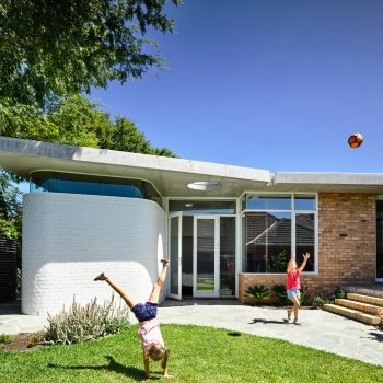
This addition to an existing Californian bungalow in Brunswick West was from the outset an exercise in ‘quality over quantity’. For the clients…achieving ‘more space and lots of it’ was never the goal, rather, opting for considered, flexible spaces that would adapt with them as a family.
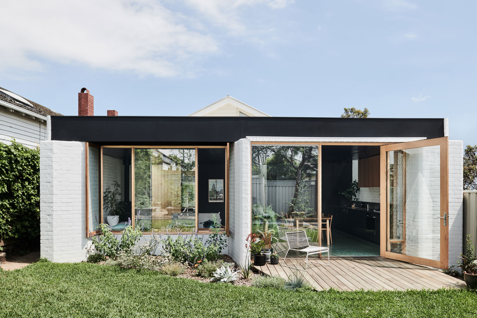
 As we know architectural firms these days rely on complex software to construct designs, however, Taylor Knights’ unique combination of textures and forms put to use in this manner suggests to this writer at least a certain spontaneity or quasi-improvisational approach, albeit on a more sophisticated level: one reason why the new spaces are so enigmatic. The particular design and placement of those forms and textures would not work if the spaces were more enclosed or the ceilings lower but nevertheless the modern sections still project a pleasing sense of “hands-on” design.
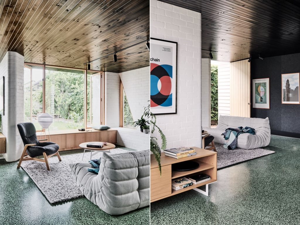
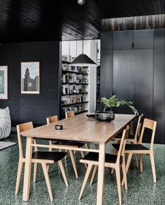
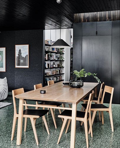
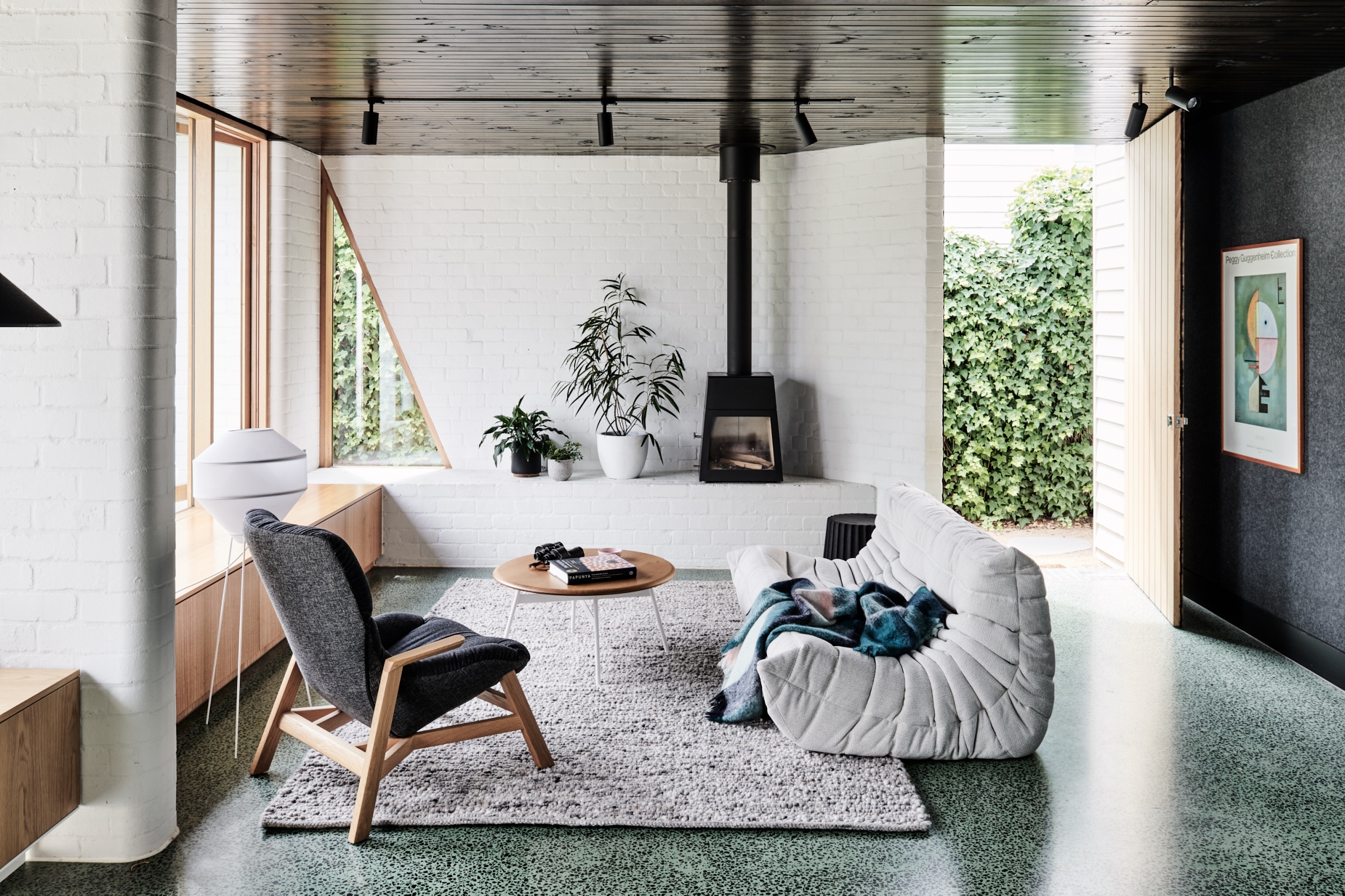
“For the client, creating a space that would also accommodate their diverse collection of artwork…a family favourite being the much-loved print of Kandinsky’s.
Upward (Empor) offered an opportunity for us to draw upon some of the artwork’s beautiful geometric and tonal elements, which in turn formed a reference for the interior palette within the new pavilion space.
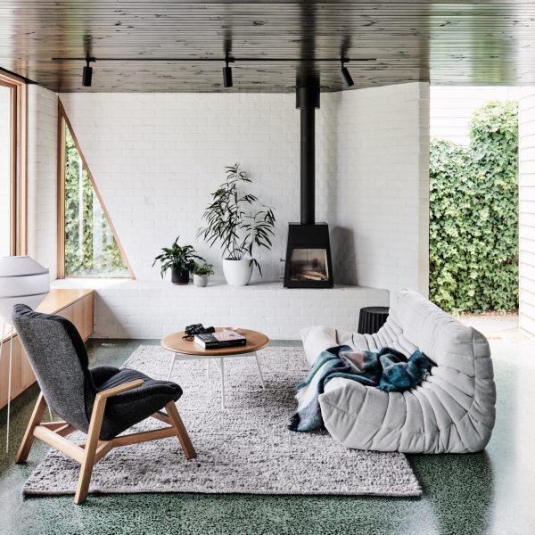
The result is the interplay between the white walls and light-reflecting timber lined black ceiling, and perhaps most noticeably, the striking sage green concrete floor flecked with dark local bluestone.”
 Interestingly, Kandinsky sought the expressive union of colour and form to impact the senses. Similarly, the architects came up with an expressive yet sophisticated rusticism seen in the various surfaces and colours in combination with the types of timber used: engaging contrasts exist between the intricate structural attention to detail (skylight, protruding and angled brick walls and windows) and the more rustic details seen in the simple lined side door, black timber ceiling slats and the concrete floor.
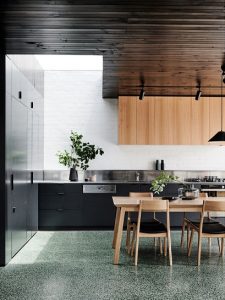
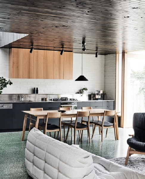
It is as if a home-skilled master craftsman has drawn from a well of historical design to come up with a soft, yet modern industrial vibe when considered with the large rectangular table, expansive opening in the back garden wall, the brickwork, ceiling and black cabinetry.
The absence of the ubiquitous island bench adds to this feeling of boutique hotel meets 19th century farmhouse in the present day.
Irrespective, it means the projected style is overwhelmingly singular and exciting: it imparts strength of character and the idea that while the clients are aesthetically and culturally aware and love beautiful things they value lifestyle and practicality over style for style’s sake.
The envelope of style defining the new area elevates this house to the next level of aesthetic inventiveness (broadly interpreted).
The way in which the architect’s have attended to the detail and textural components comments on the idea that a house can and should have a rich and positive impact on the family living in it.
 The added space should leave the inhabitants in a more refined or cultivated position going forward, otherwise what is the point? Undoubtedly, that has been achieved here.
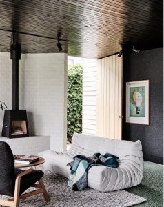
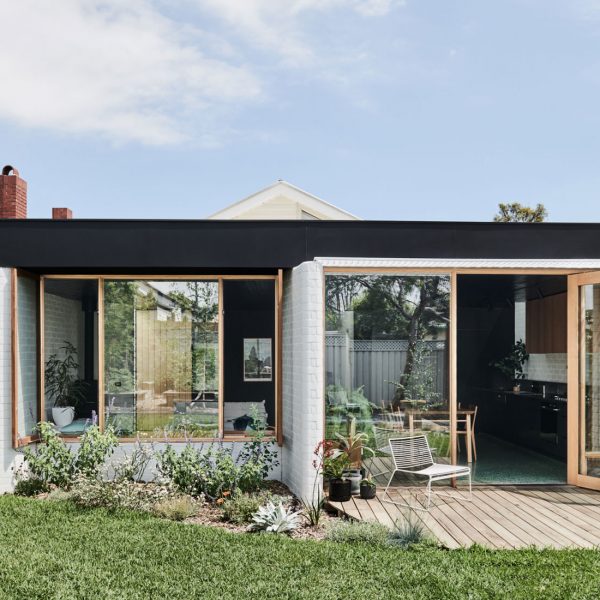
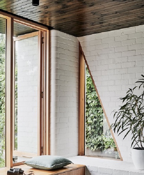
It is obvious Taylor Knights went the extra mile by offering relevant choices; in some respects obvious as in the manner the outdoors has been made accessible; the elegant expansive door to the back garden and the window seat (which puts you on the brink of both in and out): contiguous with that the adjoining brickwork seat / shelf – so lovely!
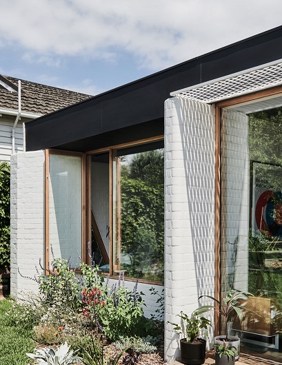
Equally interesting are the myriad visual tableaus that offer aesthetic points of difference as your eye travels over the beautiful floor to ceiling intersections which unite brickwork, walls, window and timber finishes. As an aside, a graceful interplay of both bullnose and sharp geometries exists as well as considered but slightly skewed aspects; the diminutive brick walls for example.
Every detail has a positive benefit in an immaculately thought out scheme; the pièce de résistance is the skylight hovering over both the end of the kitchen bench and the ceiling height black cabinets. This one feature is self-evidently practical in a couple of ways; most obviously it allows light into the centre of the house, but also lined in the timber slats means you will not notice dust accumulating (ditto black cabinetry); furthermore, the slatted timber lining with the expanse of light and additional height means elevated sophistication in this part of the house. Moreover and importantly also contributing to a soft rustic refinement that encapsulates the beauty of natural materials with down to earth practicality. Add to this the book shelving unit positioned strategically between the new part of the house (living) and the old part (bedrooms) – either way it not only looks stunning but is also in the perfect location.
The new kitchen/living area is possessed of a stylish quasi-improvisational approach which exudes confidence.
In spite of the impeccable details the space appears innately comfortable, perhaps derived from the various textures which not only add warmth, but imply a dedicated aesthetic vision.
 The concept of improvisation versus restraint connects to a sense that the whole thing has not been over thought, exemplified in the dichotomy between the refined and expansive pivoting door to the garden and the more rustic humble door opening to the side entrance, with a concatenation of ideas in between. This is all a small family needs, lifestyle is what is important.
The addition looks beautiful, is both practical and easy to navigate, it displays creative thinking in terms of storage, spatial solutions and presentation and importantly it is easy to look after.
What is abundantly clear by looking at the respective angles and aspects in the new section is that the architects were committed to this house and family in every way. The overall effect is gentle but robust and singular, striking and purposeful. Nothing is superfluous nor has anything been passed over. A joy to see!
Photographer: Tom Blachford


